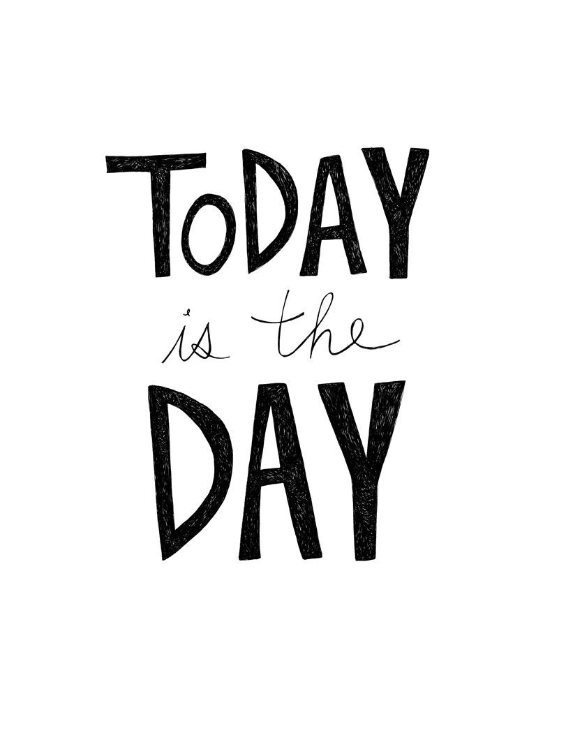
 |
| Typography print, from Virginia Kraljevic. |
Friday, September 9, 2011
The First Step.
After sustaining a minor back injury (following a rather laughable attempt to avoid a moth flying directly towards my head), I figured it was time to work on my flexibility. So needless to say, today, I begin my stretching regimen.
Labels:
art print,
back injury,
black and white,
Etsy,
exercise,
font,
stretching,
typography,
Virginia Kraljevic
Thursday, September 8, 2011
Back To The Futura.
On the heels of the news that Nike is finally selling Marty McFly's "Back To The Future" high-tops, we found this futuristic wood letter (which, of course, utilizes the futura font) to be quite apropos:
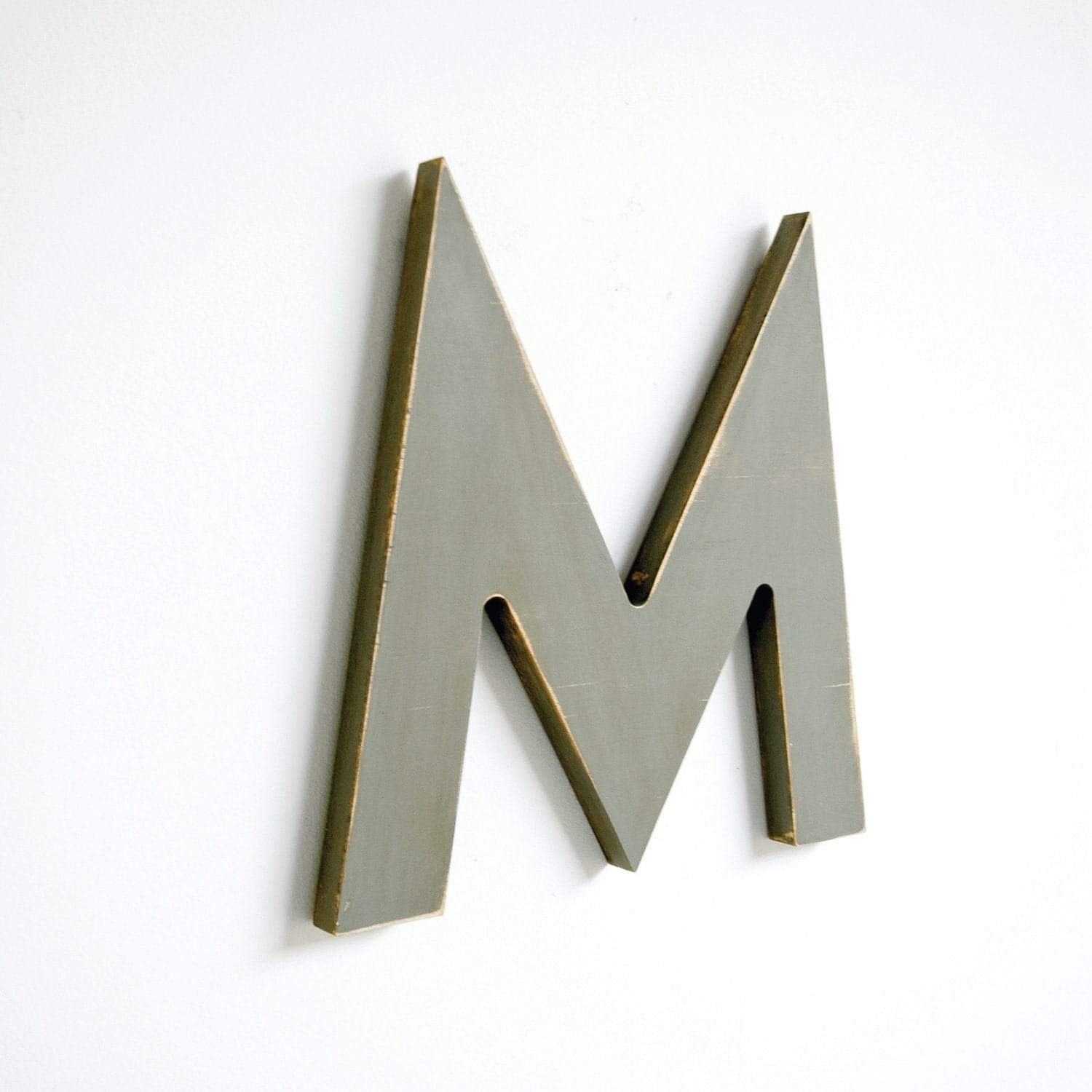 |
| Wood letter, from Edie's Lab. |
Labels:
Back To The Future,
custom,
eco-friendly,
Edies Lab,
Etsy,
gray,
handmade,
home decor,
Michael J. Fox,
Nike,
personalized,
sneakers,
typography,
wood letter
Wednesday, September 7, 2011
Runway For The Written Word.
We're huge fans of "Project Runway". And last week's challenge to create an avant garde look proved difficult for the aspiring designers. Perhaps a dose of ironic typography would've done the trick:
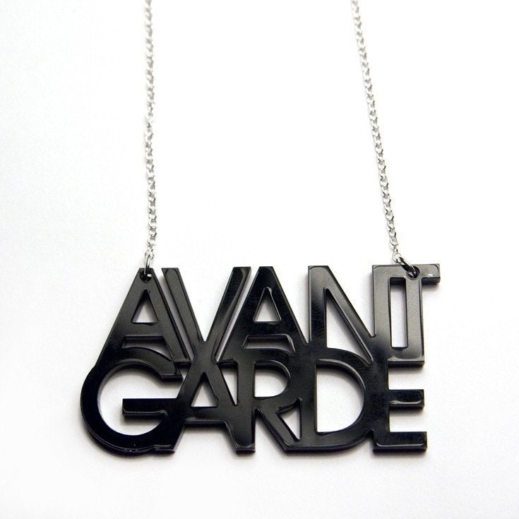 |
| Acrylic necklace, from Plastique. |
Labels:
accessories,
avant garde,
black and white,
Etsy,
fashion,
font,
handmade,
Heidi Klum,
minimalist,
necklace,
Plastique,
Project Runway,
Tim Gunn,
typography
Tuesday, September 6, 2011
Using Helvetica To Tell Time.
We love when a simple idea (along with a helping hand from the ever-reliable Helvetica) is executed to absolute minimalist perfection. The result is a typography-lover's dream come true:
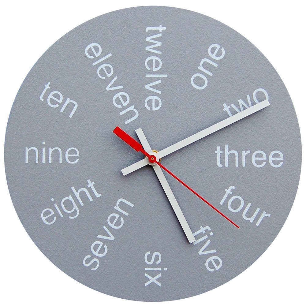 |
| Handmade clock, from Chromalab. |
Labels:
Chromalab,
design,
Etsy,
font,
gray,
hand painted,
handmade clock,
Helvetica,
minimalist,
mod,
office,
typography
Monday, September 5, 2011
Theme Of The Week: Typography.
Written communication is more than just words on paper. Certain fonts can elicit an emotional response. Even point size can sway a reader's opinion. In short, typography dictates how your message is received.
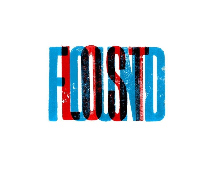 |
| "Lost and Found" art print, from Chris Waind. |
While we're not typeface elitists, we definitely appreciate the artistry behind well-executed typography. More often than not, the intended message comes through loud and clear.
 |
| Silkscreened poster, from Strawberry Luna. |
This week, we're bringing you our favorite typography-centric finds. Whether it's an industrial set of vintage letterpress numbers or an embroidered homage to the lesser-loved fonts, we're pretty sure you'll fall in love with the written, printed and forged word--one distinct letter at a time.
Subscribe to:
Comments (Atom)
